Legacy and Evolution Make an Unmistakable Brand for the Buffalo Bills
Let’s Go Buffalo!
At BZDesign, we thrive on transforming ideas into iconic designs that stand the test of time. As we kick off the 2024 football season, we’re taking a moment to celebrate the enduring success of the Buffalo Bills logo, an emblem that has not only represented the team for 40 years but also captured the spirit and energy of football fans across the nation.
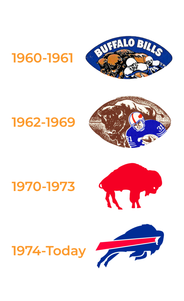
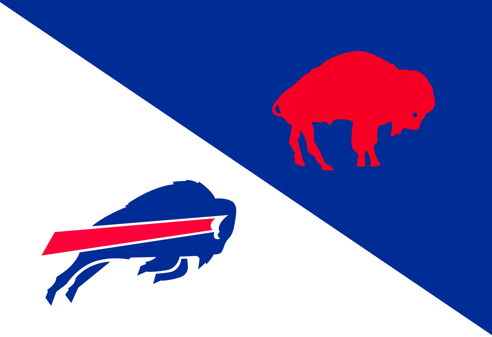
In 1973, Stevens Wright, a designer from Long Beach and a McDonald-Douglas alumnus, embarked on a freelance project that would leave an indelible mark on the NFL. Tasked with redesigning the Buffalo Bills logo, Wright infused new life into the team’s visual identity. The previous logo, a static image of a standing bison, was transformed into a dynamic symbol of motion and power. Wright introduced blue into the design, complementing the existing red, and depicted the bison leaping forward with a streak of red trailing behind it. This energetic reimagining coincided with O.J. Simpson’s record-breaking 2,003-yard season, capturing the essence of that pivotal year in the team’s history.

The new logo debuted in 1974 and was an instant hit. Over the past four decades, it has become one of the NFL’s most recognizable and beloved emblems. Only a handful of teams, including the Chiefs, Vikings, Cowboys, Raiders, and Steelers, have retained their logos longer. Wright’s design has not only endured but thrived, consistent with the resilience and spirit of the Buffalo Bills.
Despite being compensated modestly for his work, Wright’s connection to the logo remained profound. His wife, Jere, recalls how much the logo meant to him, a sentiment evident during his memorial service, where the Bills logo was prominently featured. Wright’s legacy is a testament to the power of thoughtful design and its ability to create lasting impact.
We love the current Bill’s logo, but if you asked us to choose our favorite…we’d have to pick the red buffalo that served as the Bills’ logo from 1970-1973 before Wright’s revolutionary rebrand. The retro red buffalo logo, with its bold and simple depiction of a standing bison, embodies a classic and timeless appeal. It symbolizes the strength and tradition of the team, serving as a beloved ‘legacy logo’ that fans still cherish today. This iconic image represents the roots of the team and adds a rich historical dimension to the Buffalo Bills brand.
As the Buffalo Bills take the field this season, we at BZDesign are inspired by Wright’s story. It reminds us of the importance of passion, creativity, and dedication in our work. Our goal is to create designs that resonate deeply with our clients and their audiences, just as the Bills logo has done for decades.
We wish the Buffalo Bills a successful season ahead, filled with victories and memorable moments.
Here’s to another year of great football and iconic design!
To explore our design services, visit the BZDesign Portfolio. Let’s create something amazing together. GO BILLS!
Source: Long Beach Legend: The enduring Buffalo Bills logo, designed by Stevens Wright, by Mike Guardabascio | [email protected] | Sports Correspondent. Published September 1, 2017, by the Press-Telegram.


